Blog/How to actually read a research paper (start with th…
how to read a research paper
How to actually read a research paper (start with the figures)
June 21, 2026·4 min read
Most people read research papers the same way they read articles: title, abstract, introduction, then straight through to the conclusion.
The argument in a research paper lives in the figures. Everything else -- the introduction, the discussion, the conclusion -- is context and interpretation layered on top of them. If you want to understand what a paper actually claims and whether the evidence supports it, the figures are where you start.
Read the abstract once, then go directly to the figures
After the abstract, skip the introduction entirely on a first pass. Open figure 1.
Every figure in a published paper survived a selection process. The authors had data they could have shown; they chose this particular visualization, this particular subset, this particular framing. That choice was deliberate. Your first job is to understand what question each figure is answering before you read a single word of the main text.
For each figure, work through it in this order. First, cover the legend and try to read the figure cold. What is the x-axis? What is the y-axis? What are the different conditions or groups? What pattern is visible? Then read the legend word by word -- legends are compressed, and authors often put critical methodological details there rather than in the methods section. Then ask: what is this figure claiming? And then the harder question: does the data actually show that?
The gap between what a figure shows and what the authors say it shows is where most of the important critical reading happens.
What each figure position in a paper usually means
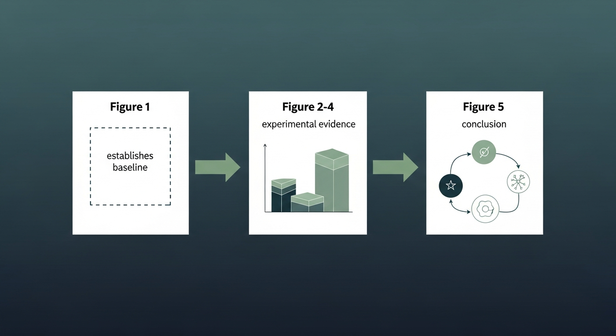
The order of figures is not arbitrary. It maps to the logical argument the authors are making.
Figure 1 almost always establishes the problem or the baseline. It shows you what the field looks like before this paper's contribution, or it introduces the system or model being studied. If you don't understand figure 1, you won't understand anything that follows.
Middle figures carry the experimental evidence. Each one is typically answering one sub-question that builds toward the main claim. Ask yourself, for each one: what would the paper's argument look like if this figure were removed? If removing it collapses the argument, it's doing essential work. If the paper could survive without it, the authors are either being thorough or padding.
The final figure usually states the conclusion visually. A model diagram, a summary schematic, a comparison against prior work. This is what the authors believe they've proven. Read it last, after you've evaluated the evidence figures, and ask whether the conclusion is actually supported by what came before it.
What to look for inside each figure
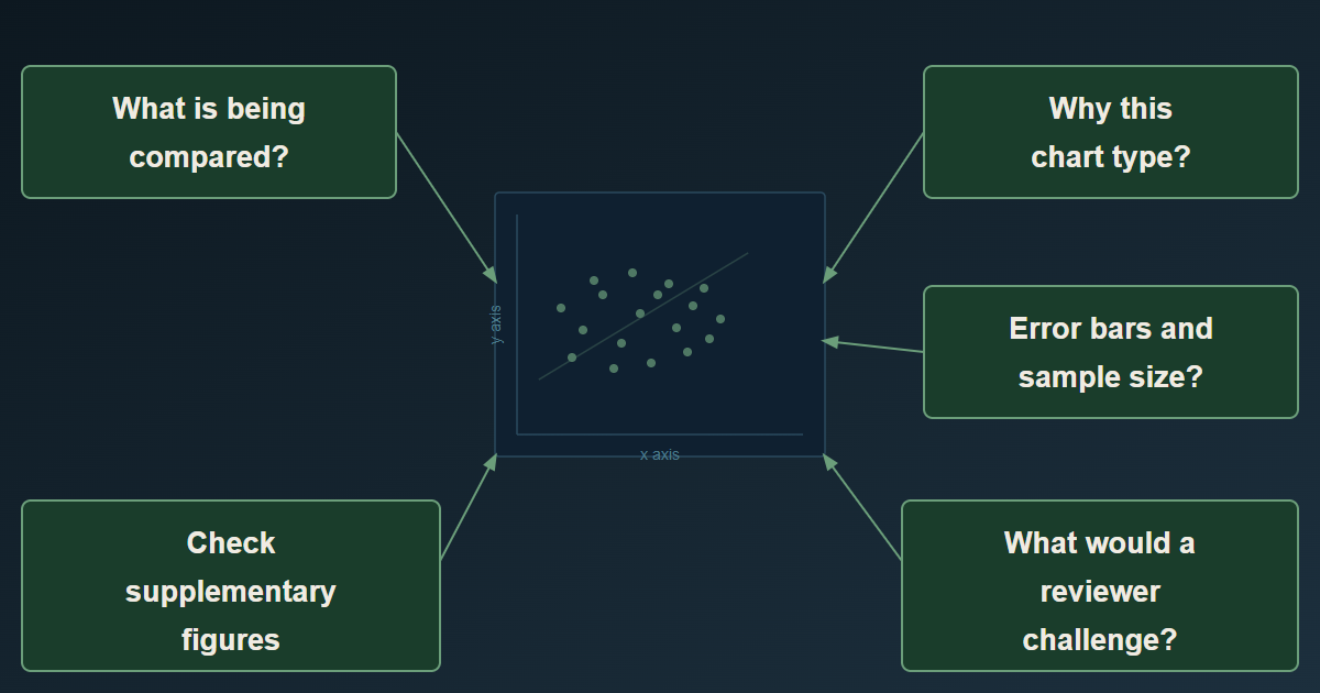
When you're examining a figure in detail, ask five things.
What is being compared? Every figure is a comparison, even when it doesn't look like one. A time series compares the system at different points. A bar chart compares conditions. Understanding what the comparison is tells you what the authors think they're measuring.
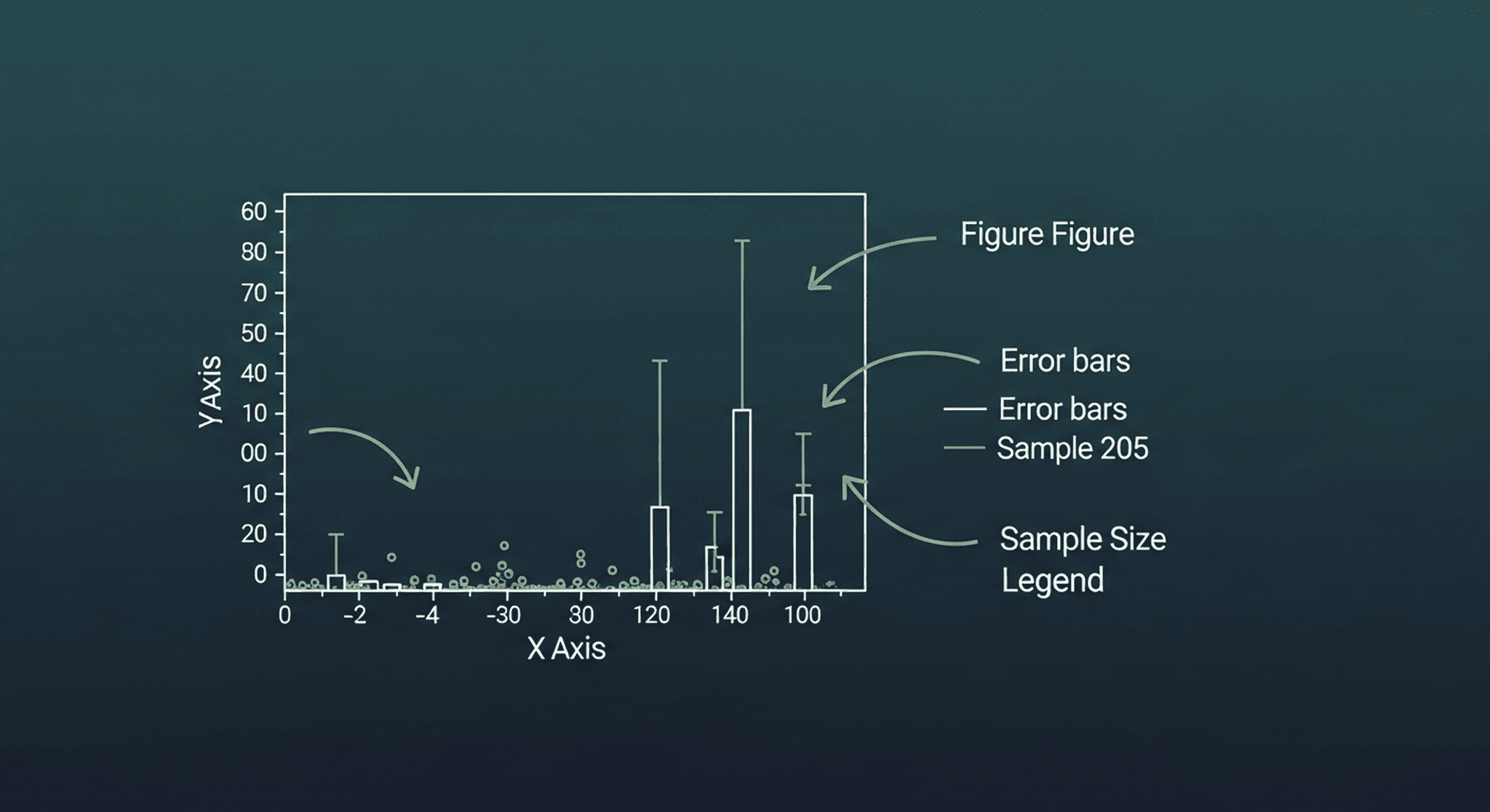
Why this visualization type? A scatter plot suggests the authors are claiming a relationship or correlation. A bar chart with error bars is making a claim about group differences and variability. A heat map is usually compressing a high-dimensional result. The choice of chart type is itself an argument about what kind of data this is.
Where are the error bars, sample sizes, and p-values? Their absence is informative. A result shown without variance information is a result the authors may not want you to examine too closely. Sample sizes belong on figures. If they're buried in a supplementary table, that's worth noting.
What do the supplementary figures contain? Supplementary figures are often where the validation data lives. Authors know reviewers look at them less carefully. Replication of a key result, robustness checks, alternative analyses -- these sometimes end up in supplementary materials not because they're minor but because they complicate the story. Check them.
What would a skeptical reviewer have asked about this figure? If you can think of an obvious alternative explanation for the pattern shown, and the paper doesn't address it somewhere, that's a gap.
How to integrate the text after the figures
Once you've worked through all the figures, read the results section -- not the introduction, not yet. The results section is the authors' verbal interpretation of their figures. Compare what they say each figure shows to what you concluded from reading it directly. Where your reading and theirs diverge is where you should slow down.
After results, read the discussion. The discussion is where authors acknowledge limitations, compare to prior work, and speculate about implications. It's useful context. It's also where overclaiming most often happens. Hold what you learned from the figures in your head as a check against the discussion.
Read the introduction last, or skip it on a first pass entirely. The introduction tells you the backstory; you don't need the backstory to evaluate the evidence.
Additional things worth checking before you read
Before investing 45 minutes in a paper, a 2-minute check is worth it. Look at the journal. Peer review quality varies enormously by venue. Check whether the paper has been cited since publication -- a 2022 paper with zero citations in a field that moves fast may not have landed. Check the conflict of interest statement. Industry funding doesn't disqualify a result, but it changes how carefully you read the claims.
For papers that feel central to your own work, look up the first author. Are they a PhD student presenting dissertation work? A senior lab head? A researcher who has published in this area for a decade? That context changes how you interpret ambiguous figures.
LitFlo surfaces the papers most relevant to your specific research area, scored against your actual interests rather than just your keywords. Once you know which papers are worth reading, the figure-first method is how you actually read them.
Try LitFlo free at litflo.ai.
References
-
Keshav, S. (2007). How to read a paper. ACM SIGCOMM Computer Communication Review, 37(3), 83-84. https://doi.org/10.1145/1273445.1273458
-
Hubbard, R., & Vetter, D. E. (1996). An empirical comparison of published replication research in accounting, economics, finance, management, and marketing. Journal of Business Research, 35(2), 153-164. https://doi.org/10.1016/0148-2963(95)00084-4
Try LitFlo
Stay on top of your field automatically
LitFlo monitors the latest papers in your research area and delivers a personalised digest — so you never miss what matters.
Get started free →Recent posts